Political cartoons illustrate the cultural zeitgeist– literally– while also offering critical commentary on it. An editorial cartoonist has a vast arsenal of tools at her disposal, allowing her to create visual metaphors, transmit brief but powerful narratives, elicit emotional responses, and present compelling arguments to persuade, inform, and potentially bolster public opinion.
An editorial cartoon can be composed of multiple panels, but the constraints of print media have created the single-panel standard. This has only enhanced the need to distill complex issues to their purest form in a single image. Within that image, emotions must be immediately readable, and symbols– including any text, whether dialog or labels– are slashed to the absolute minimum required to get the point across. It’s like trying to send a clear message in a tweet while paring it down to fewer than 180 characters.1
That’s just as true in every kind of cartooning,2 but beyond that it just makes for optimal design of user experience, generally. Familiar symbols and metaphors enable viewers to see a complex idea boiled down to its essential meaning. Familiarity and similarity are the strongest predictors of empathy, which is why Mel Brooks’ famous quote “Tragedy is when I stub my toe. Comedy is when you fall into an open manhole and die” is funny– we feel like we’re part of the “I” team along with him, even when it couldn’t be clearer that we’re actually playing for “you.”
“Diagrams are visual representations that help,” said Abby Covert in her book Stuck? Diagrams Help (which, at 352 pages, should be thankful that it isn’t a diagram). But a diagram helps by making a concept comprehensible, and doing that by locating it within a system of other concepts. Providing that context is what makes the diagram helpful.
Visual stories can be beautiful, but it’s not their first job. That just means they found work in a side hustle as a supermodel, while still fixing people’s plumbing. The visual-story-as-plumber fixes the pipes of You Understanding a Thing, in which your lack of understanding has become a clog. We shall not go into what it’s made of, or how it got there, because…ew.
So instead let’s grab a bottle of drain cleaner and move away from the “telling,” and into the “showing.”
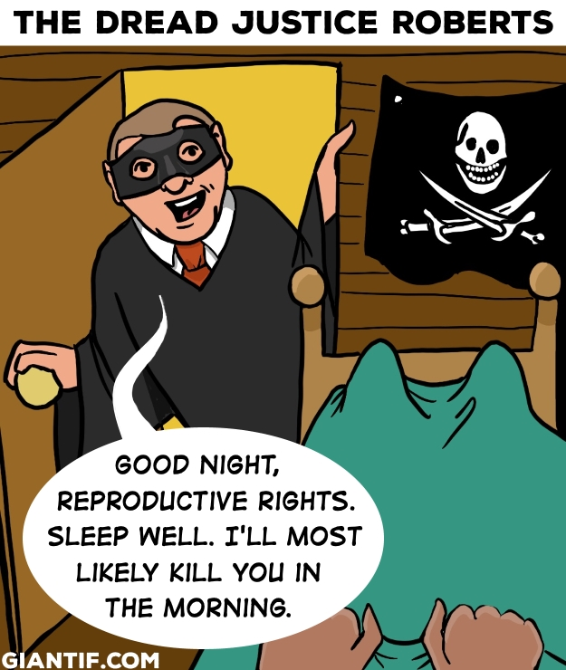
First up– implied context
“The Dread Justice Roberts,” February 12, 2019
If you’ve seen The Princess Bride, and are vaguely aware of the Supreme Court, this cartoon has a dose of resonance beyond a flat depiction of a judge threatening you at bedtime.
Rather, Justice John Roberts hangs a proposition over our heads while we cower under the covers, living in a state of constant dread that Roe might be overturned by morning (which, spoiler alert…)
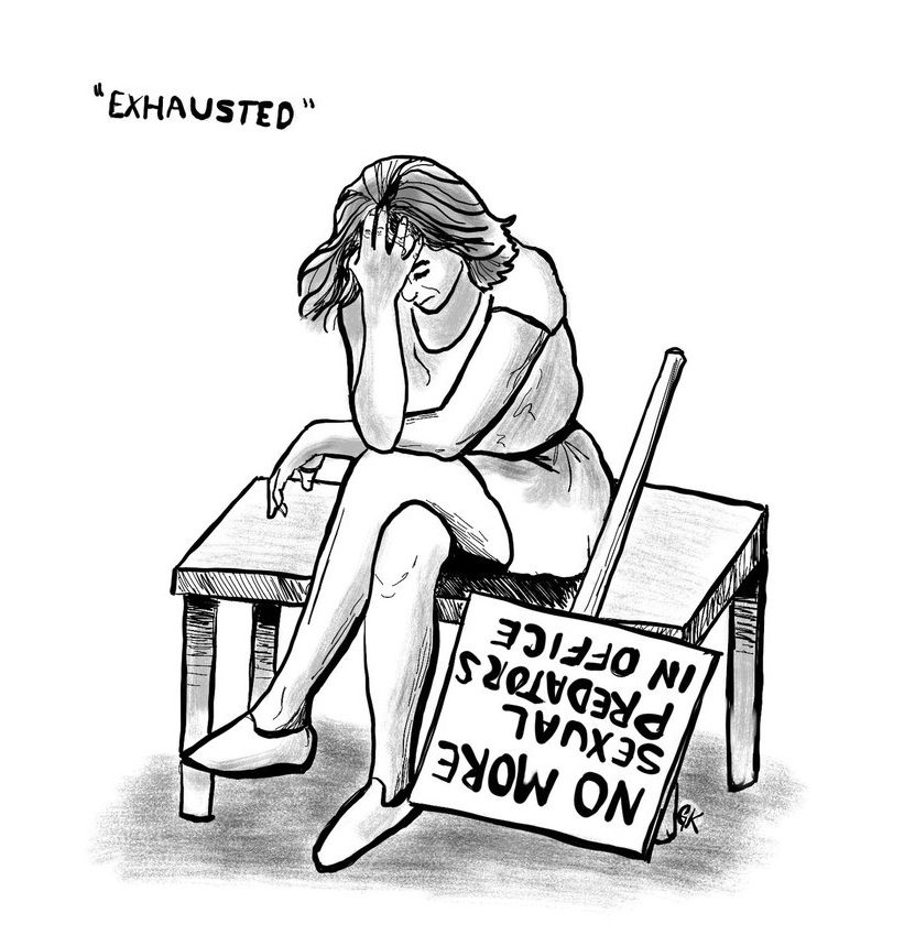
“Exhausted,” December 3, 2018
Character and Emotion
This cartoon shows how a facial expression, pose, and/or gesture can suggest a backstory and context. We don’t need to ask what the woman in this image is experiencing–the title is merely a label for what is already visible.
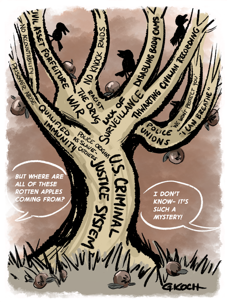
“The tree of rotten apples,” June 26, 2020
Focus on a core (har) message
Sometimes the rules are meant to be broken. The (ab)use of labels here makes the point that there are myriad effects that can be traced to a centralized cause, requiring that they be named and labeled.
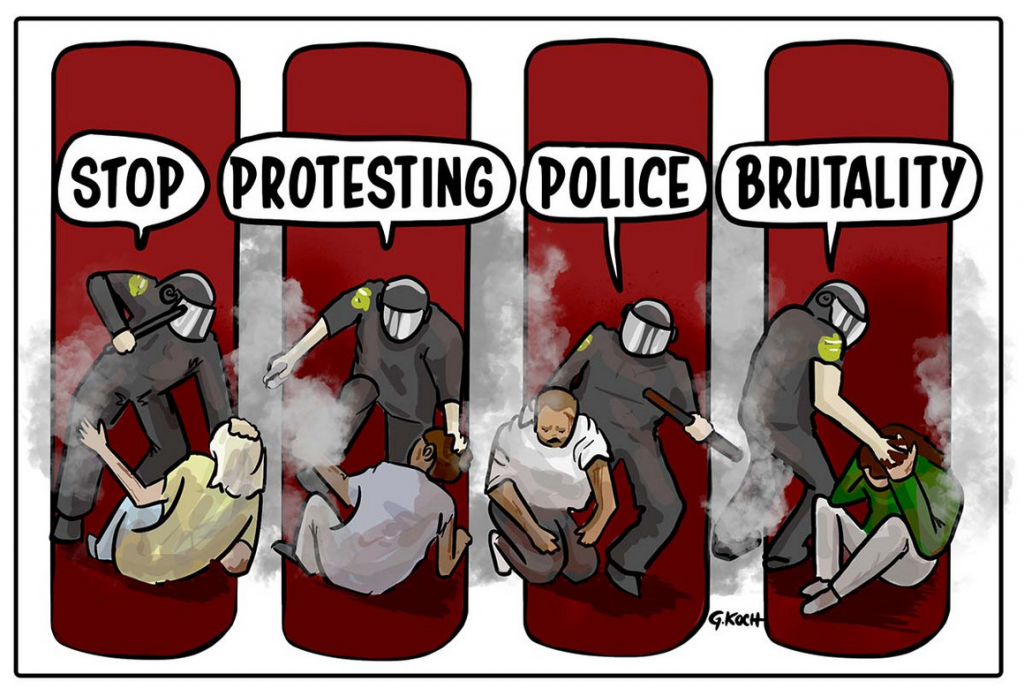
“Stop protesting police brutality,” June 5, 2020
Strategic composition
This could’ve been a single image of a police officer abusing a protestor. Making it a series of panels, however, communicates a pattern of incidents that ironically belie the message that unifies them.

“The treachery of Trump,” July 22, 2019
Captioning and Text
This is a play on words that’s better if you know who Magritte was, but it’s not necessary. You also don’t need to know French, which also is– thankfully– not necessary.
There are other principles pertaining to the elements of an impactful visual story, but these are a few that you can find in even the stories told by single-panel cartoons.
Though they contain simple messages, the experience of viewing these cartoons is not necessarily intended to be easy–rather, many political cartoonists view themselves as following a informal journalistic mandate to “comfort the afflicted and afflict the comfortable.” That’s why editorial cartoons don’t typically appear on the comics pages of the newspaper– which is not to say that their content is somehow above or below one of the “funnies,” which also tell visual stories. Those stories are just different in kind.
But even when the narrative is unpleasant and its message harsh, a visual story can feel friendlier and more honest, because the elements it incorporates are (again) shown; not just told.
We never really left picture books behind– they grew up with us, and now we’re illustrating our own.
- Or at least, that’s how it was in the Before Times. ↩︎
- Unless you count the exception that Allie Brosch carved out, which I’d describe as “mostly memoir, accompanied by illustrations of the author’s id.” ↩︎