Process Diagram: “Getting out of bed”
The problem
After undergoing a major procedure, there’s often a home treatment plan that a patient needs to follow diligently in order to recover faster and more safely. Patients who are actively engaged in their own care have a dramatically lower cost of care, yet at least 30% don’t understand their treatment plans, resulting in intentional or unintentional non-adherence. And while over 90% of healthcare organizations provide patient portal access, most see less than 25% adoption.
Twistle Patient Engagement is an application designed to deliver information to patients in a secure format that gives them personalized, step-by-step guidance through their mobile phones to manage their own respective treatment plans.
One example of this information became my project: a step-by-step diagram showing patients how to safely and comfortably roll out of bed using the log roll technique following knee or hip replacement surgery.
The motivation
Twistle’s approach results in higher patient engagement rates, improvements to medication/device adherence, and fewer readmissions. It addresses the growing trends of health inequities among people of different races, ethnicities, growing locations, and classes on a patient level, transmitting assessment forms, appointment reminders, instructions, and other communication directly via SMS text to assist patients on their care journeys.
All of that is good motivation to taken on a project like this, and it’s a fun challenge that involves design, so I was all-in.
The goal
Requested by a Twistle product manager:
Create a branded, cohesive diagram showing patients how to safely and comfortably roll out of bed using the log roll technique following knee or hip replacement surgery.
The action
My first move was to search Getty for images appropriate for the diagram, but I wasn’t seeing anything close enough. Images showing figures lying or sitting on beds were much closer to the positions I needed, but they didn’t show the full body, and there was no set of images showing the same person in all four positions.
Solution: Create your own! Using some of those images as references, I created four line drawings depicting the same person in each position, with their full body in view. These drawings were raster, so I needed to convert them to vector within Illustrator.
Challenges:
- Depicting Universality: The figure is effectively a use case persona, and part of Twistle’s identity is its ability to reach across the healthcare inequality gap. I chose to depict nondescript clothing, but in shades to sufficiently contrast with both each other and the background. The figure is faceless to emphasize the genericity of the figure and universal application of the process shown, although the figure still resembles a white man. If I did it again, I would change that.
- Determining Number Placement: There are four steps, and each one needs a label with a number that is easy to read, clearly associated with the image, and consistently placed. It’s tempting to solve the “associated with the image” factor by placing the number as close to the image as possible without overlapping it, but that inconsistency is glaring, and there isn’t any confusion about which label goes with which image if they’re placed consistently.
- Selecting Colors for Clarity and Accessibility: The labels need to use branded colors. Orange is an easy choice to complement the blue in the template, and it’s used in the Twistle logo. But I still needed to make sure that the contrast would make it easy to distinguish the orange from the background, and from its number. White numbers were an option, but according to a contrast checker they were too difficult to read, regardless of the shade of orange chosen for the background. The shade of orange passes the contrast check when used with a black number.
The education
It would’ve been faster to just start with vector images, but I really wanted to create some line drawings that were exactly what we were aiming for, rather than starting with something that isn’t quite right and trying to “make it work.” This also required me to get familiar with some features in Illustrator, but with a comfortable deadline I was able to turn out a better deliverable and attain skills to put to use in the future.
The follow-up
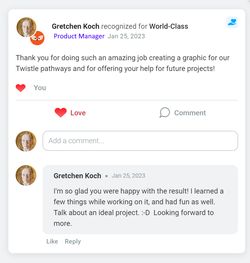
Product Manager: Thank you for doing such an amazing job creating a graphic for our Twistle pathways and for offering your help on future projects!
Gretchen Koch: I’m so glad you were happy with the result! I learned a few things while working on it, and had fun as well. Talk about an ideal project. 😀 Looking forward to more.