Political cartoons illustrate the cultural zeitgeist– literally– while also offering critical commentary on it. An editorial cartoonist has a vast arsenal of tools at her disposal, allowing her to create visual metaphors, transmit brief but powerful narratives, elicit emotional responses, and present compelling arguments to persuade, inform, and potentially bolster public opinion.
An editorial cartoon can be composed of multiple panels, but the constraints of print media have created the single-panel standard. This has only enhanced the need to distill complex issues to their purest form in a single image. Within that image, emotions must be immediately readable, and symbols– including any text, whether dialog or labels– are slashed to the absolute minimum required to get the point across. It’s like trying to send a clear message in a tweet while paring it down to fewer than 180 characters.1
That’s just as true in every kind of cartooning,2 but beyond that it just makes for optimal design of user experience, generally. Familiar symbols and metaphors enable viewers to see a complex idea boiled down to its essential meaning. Familiarity and similarity are the strongest predictors of empathy, which is why Mel Brooks’ famous quote “Tragedy is when I stub my toe. Comedy is when you fall into an open manhole and die” is funny– we feel like we’re part of the “I” team along with him, even when it couldn’t be clearer that we’re actually playing for “you.”
“Diagrams are visual representations that help,” said Abby Covert in her book Stuck? Diagrams Help (which, at 352 pages, should be thankful that it isn’t a diagram). But a diagram helps by making a concept comprehensible, and doing that by locating it within a system of other concepts. Providing that context is what makes the diagram helpful.
Visual stories can be beautiful, but it’s not their first job. That just means they found work in a side hustle as a supermodel, while still fixing people’s plumbing. The visual-story-as-plumber fixes the pipes of You Understanding a Thing, in which your lack of understanding has become a clog. We shall not go into what it’s made of, or how it got there, because…ew.
So instead let’s grab a bottle of drain cleaner and move away from the “telling,” and into the “showing.”
First up– implied context
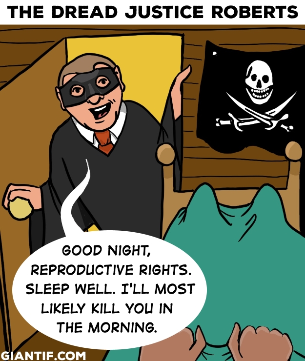
“The Dread Justice Roberts,” February 12, 2019
If you’ve seen The Princess Bride, and are vaguely aware of the Supreme Court, this cartoon has a dose of resonance beyond a flat depiction of a judge threatening you at bedtime.
Rather, Justice John Roberts hangs a proposition over our heads while we cower under the covers, living in a state of constant dread that Roe might be overturned by morning (which, spoiler alert…)
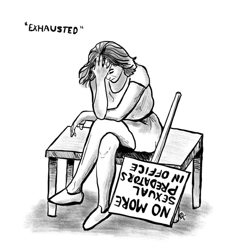
“Exhausted,” December 3, 2018
Character and Emotion
This cartoon shows how a facial expression, pose, and/or gesture can suggest a backstory and context. We don’t need to ask what the woman in this image is experiencing–the title is merely a label for what is already visible.
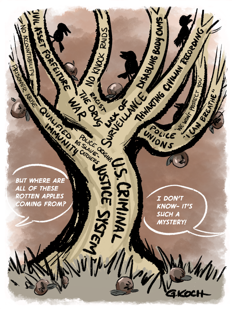
“The tree of rotten apples,” June 26, 2020
Focus on a core (har) message
Sometimes the rules are meant to be broken. The (ab)use of labels here makes the point that there are myriad effects that can be traced to a centralized cause, requiring that they be named and labeled.
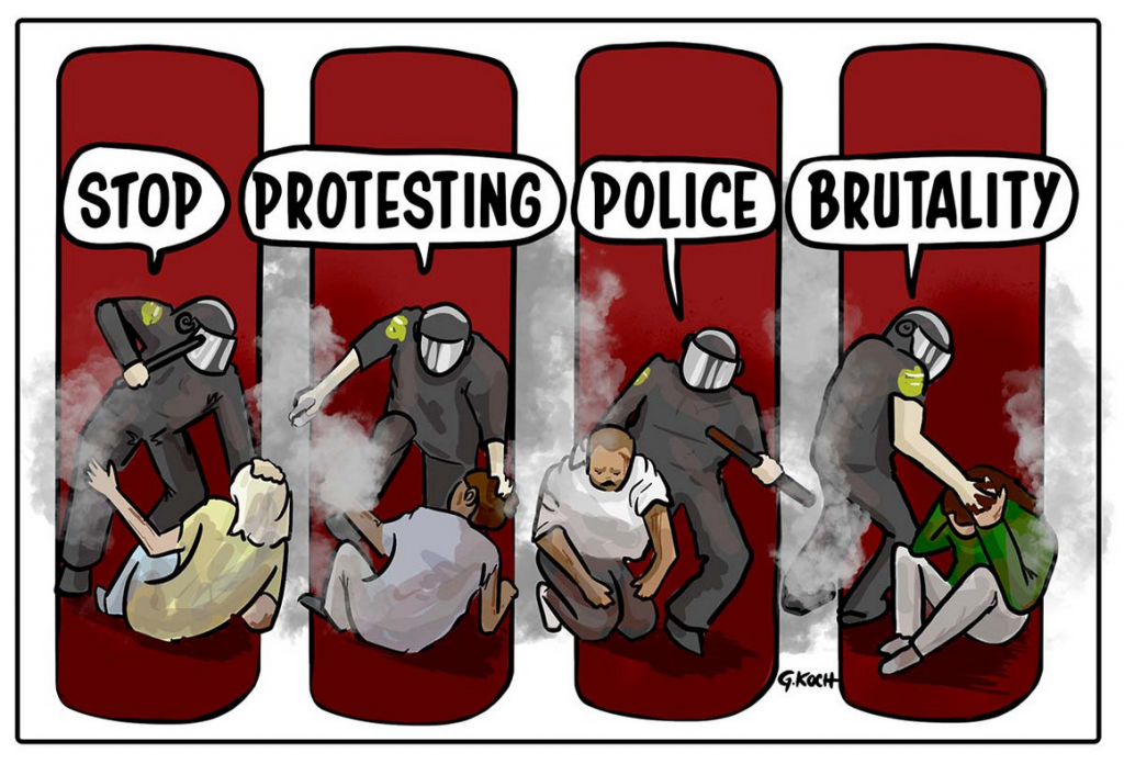
“Stop protesting police brutality,” June 5, 2020
Strategic composition
This could’ve been a single image of a police officer abusing a protestor. Making it a series of panels, however, communicates a pattern of incidents that ironically belie the message that unifies them.
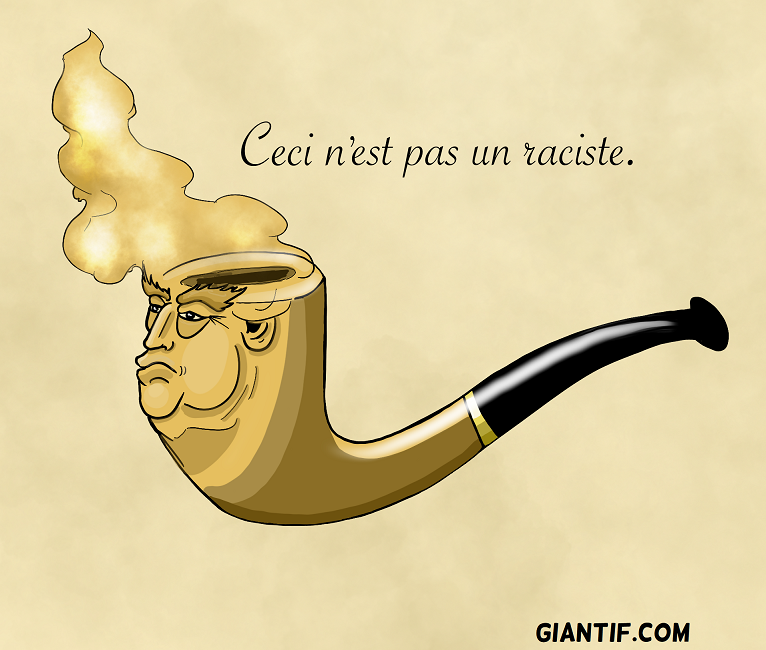
“The treachery of Trump,” July 22, 2019
Captioning and Text
This is a play on words that’s better if you know who Magritte was, but it’s not necessary. You also don’t need to know French, which also is– thankfully– not necessary.
There are other principles pertaining to the elements of an impactful visual story, but these are a few that you can find in even the stories told by single-panel cartoons.
Though they contain simple messages, the experience of viewing these cartoons is not necessarily intended to be easy–rather, many political cartoonists view themselves as following a informal journalistic mandate to “comfort the afflicted and afflict the comfortable.” That’s why editorial cartoons don’t typically appear on the comics pages of the newspaper– which is not to say that their content is somehow above or below one of the “funnies,” which also tell visual stories. Those stories are just different in kind.
But even when the narrative is unpleasant and its message harsh, a visual story can feel friendlier and more honest, because the elements it incorporates are (again) shown; not just told.
We never really left picture books behind– they grew up with us, and now we’re illustrating our own.
Or at least, that’s how it was in the Before Times. ↩︎
Unless you count the exception that Allie Brosch carved out, which I’d describe as “mostly memoir, accompanied by illustrations of the author’s id.” ↩︎
If you’re not familiar with makerspaces, here’s a definition: they’re spaces where people make things.
Literally, that’s it– you could make pretty much anything at a makerspace, with the primary constraints being your own imagination, and what you can get away with.
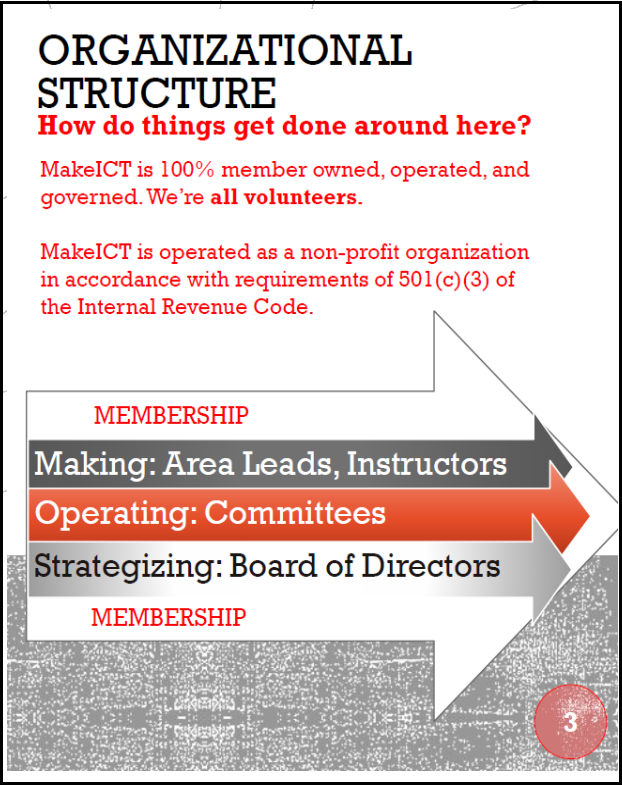
Makerspaces come in many varieties, from university fabrication labs to in-school makerspaces for kids to commercial enterprises. The MakeICT Institute, where (in full disclosure) I’m president of the board, is a 501(c)(3) nonprofit makerspace run entirely by volunteers. Our board is a “working board,” strategizing about MakeICT’s future while also being actively involved in meeting the organization’s needs on the premises.
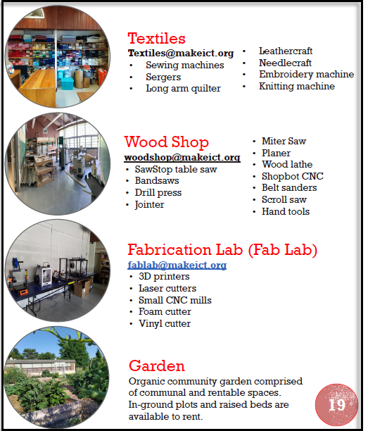
MakeICT operates out of a former elementary school, with classrooms converted to shops dedicated to each domain of “making,” from a fabrication lab to a woodshop to a metal shop to textiles, and ceramics, and more. Each area has an area lead responsible for purchasing tools and supplies, and generally keeping the area in good working order. Committees exist to run events, process new memberships, tackle IT needs, and generally keep the place running.
As an organization, MakeICT functions as a community of makers with a mission to “innovate, learn, and build community at the intersection of art, technology, science, and culture.” It prides itself on being welcoming and accessible by keeping membership prices low, allowing 24/7 access to the space for members, and inviting members to teach classes at various levels of expertise, for which they receive 75% of the registration fees. MakeICT also hosts and organizes events for members and external organizations, offering makers a chance to display and sell their work.
Goal, audience, and scope
This is a content design and strategy proposed for MakeICT that has largely not yet been implemented.
Problem: MakeICT’s existing content was developed with care, but without organization. It’s difficult to navigate, inaccurate/outdated information sprinkled throughout, and in general it badly needs a makeover.
Goal: A mission statement is inspiring, but a content design strategy expands on that inspiration. The goal is to present unified content that establishes a brand/identity for MakeICT for use in promotional and educational materials.
Audience: Members and prospective members, partners and prospective partners, and donors and prospective donors.
Scope: The scope of this project extends to online content, presentations, and printed materials for the makerspace.
MakeICT’s online content includes:
Social media posts
Website
Wiki
Forum
MakeICT’s presentations include:
Internal training sessions (e.g. the “‘how to teach a class’ class” )
New member orientation sessions
“Maker Monday” presentations (members of the public are invited to tour the space, and are given a general overview of what MakeICT is)
Presentations for external organizations
MakeICT’s printed materials include:
Flyers
Brochures
Guides
Limitations
Shoestring budget – We get donations and sometimes discounted goods and services, but everything starts with spare time and the will to make something happen.
Compensation: It doesn’t take a lot of funds to makeover a website, for example, or shift the voice and tone of posts on social media. A dramatic change to printed guides and presentations is more of a financial hurdle, but getting people on board in advance of making changes will minimize the impact.
Volunteer authors/designers – No training is required. There’s a small Communications committee, but otherwise, any of active membership may contribute content.
Compensation: Enthusiasm makes the difference, and strategizing together makes people feel included and inspired to create content on their own. Holding a meeting or two to formulate a “plan of attack” would compensate for the lack of training.
Persona
The persona I see for MakeICT is The Friendly Guide. The Friendly Guide’s characteristics are:
Warm and welcoming
Passionate about sharing knowledge
Empathetic in addressing the varying skillsets and backgrounds of members
Passionate about innovating, broadening horizons, and pushing the limits of creativity
Eager to engage in collaborative projects with a playful and inclusive spirit
The Friendly Guide insulates you from the inherent risks of trying out a new hobby, which typically requires investing in expensive tools and materials, and then hunting down sources of expertise, before you’re even sure about getting in deeper. Minimizing these risks enables “hobby creep,” which is when the Friendly Guide nudges you and whispers “Hey, check this out!”
You experience “hobby creep,” for example, when suddenly you’re walking across the hall from Textiles, where you were quilting using the long-arm quilter that inspired you to join, and into Ceramics. Suddenly you’re centering a pot on one of the electric wheels, and you could swear that you you hear Unchained Melody playing in the background. Congrats! You’ve found a New Hobby.
The Friendly Guide lets you mess up on a project (repeatedly) using free materials, teaches a range of classes that introduce tools and skills, and steps in to prevent you from, say, electrocuting yourself while using the powder coating gun (ground it, silly).
The Friendly Guide knows you don’t have a lot of cash, and keeps membership prices low. The Friendly Guide knows you work weird hours, and lets you access the space 24/7. The Friendly Guide isn’t a teacher, a boss, or your dad, but rather a good friend who’s knowledgeable but also known for getting up to occasional hijinks and shenanigans.
Voice
Design Principles
MakeICT’s design principles are:
Collaborative
Dynamic
Accessible
Concepts
The concepts that support each of these design principles are:
Collaborative
Dynamic
Accessible
Communal skill development
Experimentation
Welcoming to members of different backgrounds and experience
Cross-disciplinary projects and events
Pushing boundaries
Teaching at multiple skill levels
Networking and support
Innovation
Low-risk “hobby creep”
Celebration of achievements
Creative exploration
Guided introduction to new tools and skills
Project: New member orientation guide
After attending a Maker Monday (a tour of the space, open to the public), a prospective member can apply for membership and pay their first month’s dues. Once their application has been accepted, they are invited to attend a new member orientation session, which is composed of a) a more in-depth tour b) a Q&A session to get to know each other and existing members, and c) the opportunity to get a badge created which provides 24/7 access.
The new member orientation presentation contains a lot of new information, including off-the-cuff remarks by the presenter. This booklet supplements that presentation, gives new members a place to take notes, and provides a resource for them to take home, post-orientation.
That’s our logo, the little guy with his mind blown–literally– with ideas for things to make. ICT is Wichita, Kansas’s airport code (apparently federal regulations prohibited airport codes from beginning with “W” or “K,” reserving those for radio stations).
The gears and tools emerging from someone’s head via a hinged trapdoor gives a vibe of both “playful” and “industrial,” so I aimed to keep that tone throughout the guide.
Table of Contents: What to include, and where (and why)?
Because MakeICT is entirely composed of, and run by, volunteers, it’s important to emphasize this fact from the outset, giving new members a sense of what “volunteering” means.
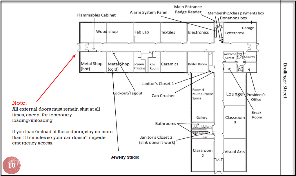
The next most important thing is the map, because MakeICT is a converted school and it can be easy to get lost, so the map gets the centerfold on pages 10-11.
The FAQs comprise the “meat” of the booklet– they’re its entire raison d’être.
Lastly, the list of areas and contact information for the leads is included as a resource.
My mind is regularly blown by how an organization run entirely by volunteers manages to hold together from day to day, let alone expand and outgrow two prior facilities before moving into its current location.
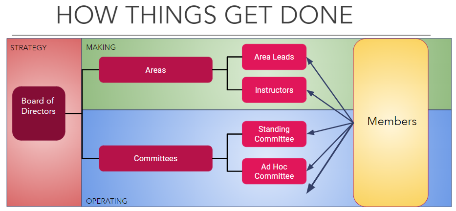
I reworked the diagram showing the components that contribute to MakeICT’s trajectory. Below is the preexisting version, which I found confusing and too complex to convey the idea that membership encompasses all of the engines that power the organization.
Practically speaking, a letter to new members from the sitting president means that the next president will need to swap in their own message next June, and that we can’t just print a billion of these guides with the expectation of using them forever.
But I think it’s important for the president to represent the makerspace up front, in print– to literally speak for the organization, and communicate in a friendly but sincere way that all are welcome, i.e. to be the Friendly Guide.
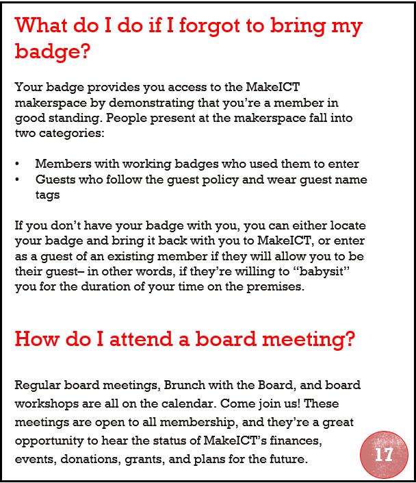
Most of the FAQs are in random order, and they all have the same look and feel, so I won’t go through all of them. However, it’s vital to have the “forgot my badge” question up front. It’s a leap of faith to allow someone 24/7 access to the space, and members justify that level of trust by acting as individual, informal security guards.
This is the Friendly Guide chiding members that they don’t get to skirt the rules, but giving them an “out” if a member with a badge agrees to “babysit” them (which I have done, by the way. It’s…boring, as babysitting often is.).
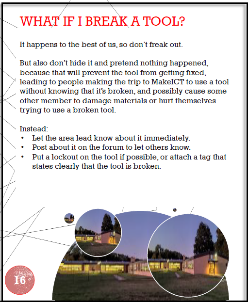
There’s also a huge amount of trust in giving unsupervised access to a broad variety of hand and power tools, some very dangerous and/or very expensive.
This is the Friendly Guide’s voice again, threading the needle by using a friendly and reassuring tone, deflecting the potential of shame to convey a necessary point about caution and responsibility.
The Friendly Guide wants you to have fun exploring how to powder coat metal– but not to drive you to the hospital because you electrocuted yourself while powder-coating.
We don’t have a “You are here” style map at the front entrance, though perhaps we should. There are also no staff watching over the Welcome Center, so members and guests are pretty much on their own to navigate the space. However, there is a computer at the Welcome Center, where you can do the following:
Fill out a waiver, which everyone must do before spending time in the building.
Fill out and print a guest badge, which guests must wear for the duration of their visit.
Check in students for classes and verify that they’ve signed waivers and paid the course fee.
That computer is hard to miss and space is limited, so I opted to point out that the main entrance is where the alarm system is managed, and where you can drop cash and checks to either donate or pay membership fees in person.
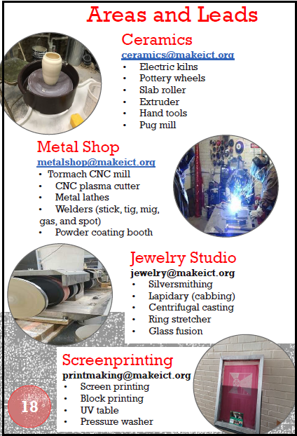
Each area has its own email address so that members don’t have to memorize the lead’s name. Lead turnover isn’t frequent, but it does happen, so this way the guide won’t need to be updated each time.
It can be tricky to remember what major tools exist, and what classes are offered, in each shop, and this handy list makes it simple to entice your friends to become members as well. There’s something for everybody!
Where to go from here?
Videos
The most immediate application of these design principles is creation of videos. The membership committee lead is also a Director At-Large, and he and the Vice President have expressed interest in creating videos– potentially one video per area, ideally with the area leads providing brief (30 seconds to a minute and a half) overviews of their respective areas. These videos can then be put to use in several contexts:
The videos could be uploaded to the wiki, so that–for example–visiting the Textiles wiki page would give a member the option to watch a brief video explaining what tools and materials are available, and which classes are taught in that area.
The videos could be included in a Maker Monday or orientation presentation, to give prospective or new members a chance to learn about a given area without area leads having to be on-site to personally give the same overview of their respective areas that they’ve given every other Monday, as long as they’ve been an area lead.
The idea of area-specific overview videos was sparked by a Director At-Large who is disabled, as a means for disabled members to become acquainted with various areas without having to make the physical trek between them, down the halls and back, and standing/sitting in the room for the duration of time required for the area lead to give an overview.
Web Site and Wiki Content
The Secretary of the board and some former members of the board are engaged in a project to revamp the site and the wiki, providing useful information that is easy to understand and navigate. With the web site in particular, the content is public-facing and should project the Friendly Guide persona and use its voice to communicate with curious prospective members, and- crucially– members of external organizations who seek to partner with MakeICT.
Internal and External-Facing Presentations
MakeICT partners with external organizations in different ways, from providing an event venue for community groups, to participating in offsite events to publicize MakeICT and provide opportunities to children to become “makers” themselves, to giving presentations for outside groups on what MakeICT is and does. These presentations will benefit from a unifying set of design principles that ensures consistency in content messaging across events and audiences.
Looking Forward
MakeICT was incorporated on December 13, 2012 as a Kansas not-for-profit corporation. It has maintained that rag-tag sense of spirit throughout, but there’s no necessary conflict between maintaining that image and creating more refined messaging that emphasizes community and innovation. For that matter, there’s arguably a symbiotic relationship between the two, and it’s embodied in the persona of Friendly Guide. The principles of being Collaborative, Dynamic, and Accessible can guide MakeICT’s mission to become a welcoming community that celebrates scientific and artistic exploration.
Being a maker is inherently exhilarating, because it means engaging in creation– bringing something new into the world. Creating content about the makerspace is part of that, because it’s also a form of making.
MakeICT has a huge appeal, but that’s not something to take for granted. You don’t want to just make friends, after all, but to stay friends. Creating content for a thriving community, to help it thrive, is an ongoing process that will only improve as we go, for as long as we’re driven to make that happen.
Or, why good storytelling requires good representation:
When the story doesn’t contain the “why,” the audience looks to the author.
Let me back up.
Writers are often advised to “write what you know.” That’s good advice, because you can’t write believably about what you don’t know. However, authors who took this advice to a logical extreme and wrote only about people just like themselves would suffer for it. They wouldn’t tell very interesting stories– or at least, they would have only one interesting story to tell, and it would effectively be a memoir.
Rather, fiction writers write what they know by research. If they want to write a story about a marine biologist, they would research marine biology. They would research what working as a scientist in that field is like, what kind of person goes into that field, what kind of education and training it requires, and so on.
Because even though it’s fiction, believability is key. Fiction writers create worlds that are not identical to this one for the entertainment of the reader, but those worlds contain things that exist in our own world– like people. If the people in the story don’t act like people do in the world world, and no reason is given for this, the audience is confused. The story falls flat. It’s bad storytelling.
So this is a kind of constraint on the author. When writing fiction it’s literally true that an author can write any story he or she wants– nobody is going to come in and hold a gun to his/her head and demand that he/she not write the story. However though the author is entitled to write whatever story he/she chooses, he/she is not entitled to the audience’s reaction. The audience is not required to think highly of the story. The audience is not required to think highly of the author.
As an example, imagine an author who writes a book whose story involves the sole white occupant of a town being lynched by the rest of the town’s population, which is black. If a believable explanation for this plot line can’t be found in the story, the audience is going to guess that either the story is satire, or the author has some serious issues with black people. Their likelihood to understand the story as satire is a blend of their own knowledge and the author’s adeptness at storytelling. Bad satire happens when the audience can’t be expected to have the knowledge that will tip them off to its satirical nature, or when the author doesn’t wink hard enough in the writing of the story to make it clear. Or both, of course. When the audience doesn’t detect satire (it doesn’t provide the “why,”) then they quite reasonably look to the author’s own beliefs for the explanation.
Good storytelling involves researching the elements in your story if you don’t know very much about them. Bad storytelling involves misrepresenting those elements or leaving them out altogether in a way that isn’t believable. An author who wants to tell a story about a world congress, in which multiple leaders from every country gather together to exchange ideas, isn’t practicing very good storytelling if his/her story depicts this congress as containing only white men, unless a reason is given for this. Was there some mass extinction of women and people of color? Did the white men totally take over the world, including the government of every country on the planet, and if so….how did that happen? The extraordinary event requires an extraordinary explanation. In fact in this case, it would be such an extraordinary explanation than it might as well be the story. If it isn’t, but is treated as a totally unremarkable circumstance by the characters in the story, the audience would rightly look to the author with a “WTF?” expression on its collective face.
These examples are extreme, but that’s on purpose– to illustrate how the content of a story can lead the audience to negative conclusions about the beliefs and prejudices of its authors. The less cut and dry it is, obviously the less justified the audience would be in reaching these conclusions. But the audience is not wrong to see an unbelievable depiction of people in a story and assume that the explanation lies in the author’s motives, and they’re going to do it regardless.
The first people to notice when certain groups of people are misrepresented in or left out of a story for no discernable reason are, quite naturally, people in those groups. But they’re not the only people who do notice or should notice. It might take a white guy a little longer to look at the “world congress” and think “Hey, wait a minute….why is it only people like me?” But he wouldn’t be very bright if he never got there. Not very bright, or else like the author in either prejudice or ignorance (or both).
People want to hear stories told about people like them– yes, of course. However, people also want to hear good, believable stories. If a story makes you stop and wonder why the author portrayed characters in a way that rings false, or leaves them out altogether when it seems like they should be there, that’s bad storytelling unless making you wonder these things is the author’s point– and even then, if you can’t tell whether it is or not, that’s a problem.
That’s why diversity matters in storytelling– not just because people want to hear/see it, and they do, but because it makes the story better. Because the story contains the “why.”