Context
Twistle Patient Engagement is an application designed to deliver information to patients in a secure format that gives them personalized, step-by-step guidance through their mobile phones to manage their own respective treatment plans.
Patients who are actively engaged in their own care have a dramatically lower cost of care, yet at least 30% don’t understand their treatment plans, resulting in intentional or unintentional non-adherence. And while over 90% of healthcare organizations provide patient portal access, most see less than 25% adoption.
Twistle’s approach results in higher patient engagement rates, improvements to medication/device adherence, and fewer readmissions. It addresses the growing trends of health inequities among people of different races, ethnicities, growing locations, and classes on a patient level, transmitting assessment forms, appointment reminders, instructions, and other communication directly via SMS text to assist patients on their care journeys. At the same time it proactively answers common questions, reducing the load on care teams and making them more efficient.
The Project
- Create a branded, cohesive diagram showing patients how to safely and comfortably roll out of bed using the log roll technique following knee or hip replacement surgery.
- Make sure you use colors from the branded palette.
- Share both the PDF and Adobe Illustrator versions of the file with the product team.
Requested by: Product Manager
Factors to Consider
- Constraints:
- The branded template must be used. This template includes text, font, formatting, and color for the blue header and footer banners.
- The figure must be shown with both arms and legs and an average body size.
- The figure’s entire body must be shown.
- The figure must be depicted on a bed.
- Image choice:
- Finding vs. Creating: When discussing the project with my manager, our initial plan was to grab images from Getty, using key words with “yoga” or “stretch” to get closest to the necessary body positions. However, while doing these searches I wasn’t seeing anything close enough. Images showing figures lying or sitting on beds were much closer to the positions I needed, but they didn’t show the full body, and there was no set of images showing the same person in all four positions.
Solution: Create your own! Using some of those images as references, I created four line drawings depicting the same person in each position, with their full body in view. These drawings were raster, so I needed to convert them to vector within Illustrator.
- Finding vs. Creating: When discussing the project with my manager, our initial plan was to grab images from Getty, using key words with “yoga” or “stretch” to get closest to the necessary body positions. However, while doing these searches I wasn’t seeing anything close enough. Images showing figures lying or sitting on beds were much closer to the positions I needed, but they didn’t show the full body, and there was no set of images showing the same person in all four positions.
- Figure Design:
- Depicting Universality: The figure is effectively a use case persona, and part of Twistle’s identity is its ability to reach across the healthcare inequality gap. I chose to depict nondescript clothing, but in shades to sufficiently contrast with both each other and the background. The figure is faceless to emphasize the genericity of the figure and universal application of the process shown.
- Choosing Superficial Characteristics: The body reads as masculine-presenting, but I think that was largely an arbitrary choice (it could just as easily been more feminine). I chose a skin color and hair color/style/texture that, combined with the absence of facial features, would read as racially ambiguous. I think the choice of superficial features matters when visually depicting a user– it’s impossible to be truly universal, but we can strive to depict an average/representative sampling where possible.
- Labeling the steps by number:
- Determining Placement: There are four steps, and each one needs a label with a number that is easy to read, clearly associated with the image, and consistently placed. It’s tempting to solve the “associated with the image” factor by placing the number as close to the image as possible without overlapping it, but that inconsistency is glaring, and there isn’t any confusion about which label goes with which image if they’re placed consistently.
- Selecting Colors: The labels need to use branded colors. Orange is an easy choice to complement the blue in the template, and it’s used in the Twistle logo. But I still needed to make sure that the contrast would make it easy to distinguish the orange from the background, and from its number. White numbers were an option, but according to a contrast checker they were too difficult to read, regardless of the shade of orange chosen for the background. The shade of orange passes the contrast check when used with a black number.
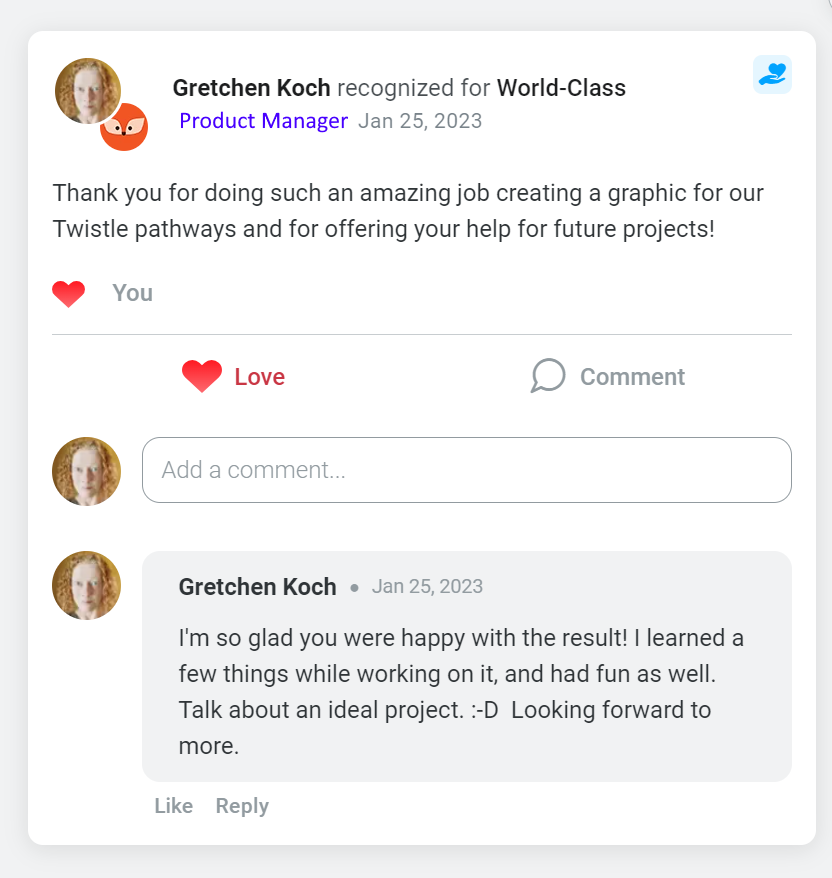
Completion Date: 1.25.23
Result
It was a learning experience, and this definitely wouldn’t have been the best route to take with a rapidly impending deadline. It would’ve been a great deal faster to just start with vector images, but I really wanted to just create some line drawings that were exactly what we were aiming for, rather than starting with something that isn’t quite right and trying to “make it work.”
Unfortunately there were no future needs along these lines, because the team ended up buying a pack of image resources for their own use. But it would’ve been fun to keep creating materials with a similar look, and much faster to create them going forward.


Feedback